Idea and Inspiration
For this project I wanted to create a logo for my blog. I wanted this logo to represent what my blog is about and also be simple, yet unique. The way I decided to do this is by having my logo be a dress form. Dress forms are used in every part of the fashion world from design studios to retail stores and everything in between, so I thought it would be a good way to make my topic obvious to viewers.
Design Process
I didn’t really do any research to help develop my idea because I pretty much knew what I wanted to do from the get-go. The significance of the capital letter Q in the center of the dress form represents the first letter of my first name. The dress form itself is significant to me because in my first retail job that really developed my interest in the fashion world, I would work with them everyday either dressing them or setting up displays. My design process consisted mostly of looking and hundreds of different dress forms to find one that had the shape I wanted. It also included picking out the font I wanted to use.
Technical Detail
I found the image I used as a reference when tracing the dress form on Google Images after I typed in dress form and scrolled for about 5 minutes. I traced the image in illustrator with the pen tool on the right side. Then I copied and pasted the right side and used the reflect tool to make the two sides be able to match up. I then joined these two paths together to create one shape. After that, I changed the fill to a light pink color and the stroke to none. I then went and looked at the fonts for a while and tried out a bunch of different ones before settling on Source Serif Variable. Finally, I selected both the text and shape and rasterized them.
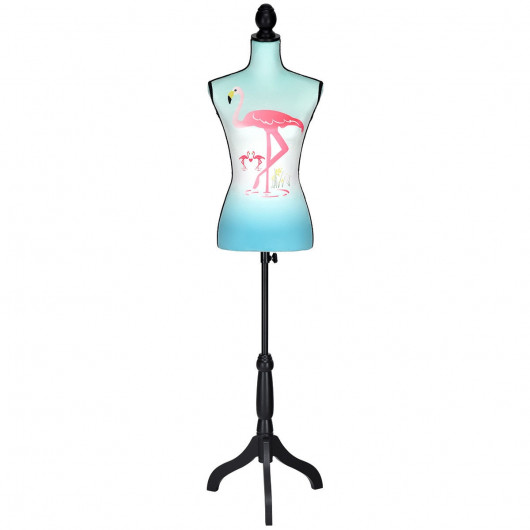
https://www.costway.com/height-adjustable-female-mannequin-torso-dress-form-display-stand.html

I really liked your idea incorporating a dress stand with your initial. Its complex enough to know what it is supposed to represent, yet simple to not overload the eyes with information. One critique I have is to make the stroke outline on the outer shape a little thicker. It would help smooth out some of the jaggedness around edges and turns, and also help with website compression. Second is to maybe consider designing your own ‘Q’ instead of using a font. This would help make the design a little more yours. Your design looks very nice, and the two colors you have chosen are very nice compliments to each other.
LikeLike
Quinn- Your design is so cute! I can tell right away that the theme of your blog is about fashion! I also like that you added a personal touch to it by adding the Q to the middle of your design. Adding the two elements of personal and business together gives your logo a personal touch. The only elements I would change is to have the edge of your design a little more precise the edge just looks a little uncut and jaded another fix for that problem would to be to outline it to make it look bolder. Also maybe adding a few outlines of clothing pieces to the logo would give it more depth and make it look a little advanced.
LikeLike
I think this logo perfectly embodies your topic and what you hope to achieve with you topic. The object you chose is a very good representation of fashion and is pretty much universal knowledge, which is perfect when creating a logo. Something I would adjust is with the white “Q” and the very light pink object, it sort of blends together a little bit, and to make it more eye catching I would either outline the Q, or change the color to see it better. Something you could also do is make a floral pattern on the dress mold (is that what it’s called? Sorry I’m not quite sure!) to show your creativity! Another thing I would possibly add is a darker outline to the outside, it could even be a darker pink, it would just help it catch the eye of your audience better. Good luck with the final draft!
LikeLike