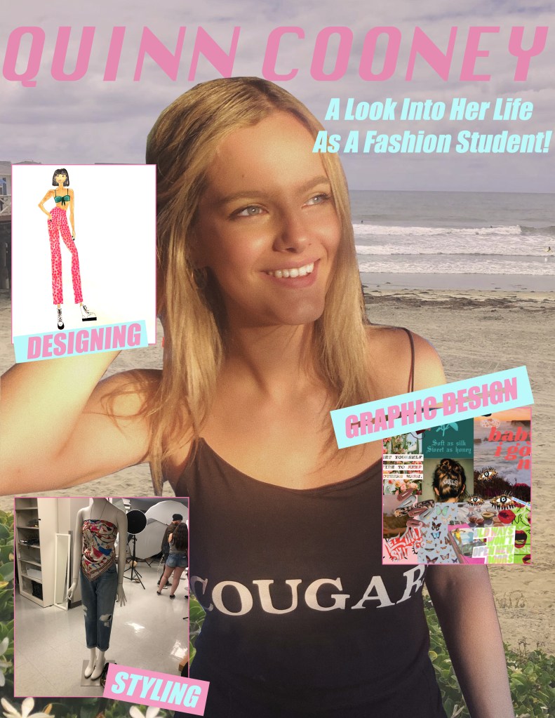
For my Graphic Design Project I have decided to create a magazine cover! My magazine cover has images describing what my blog is about and various images I have collected from my projects as a Fashion Merchandising Student. This project idea relates to my topic because it allows me to explain the three main things I am passionate about in my major and my potential career path.
The design influences that inspired me came from mostly the tutorial on the bulletin board with the different buildings at WSU and also from my color palette that I created when I designed my collection last spring. Research that I did to form my idea was just perusing magazine covers online and seeing what they consisted of.
The significance of the background of my design is the main place that gives me inspiration, the beach back home in San Diego. The other elements of my design have significance because they are all projects that I put my entire heart into.
My design process started out by using the pen tool to cut out the image of myself and mask the background. Then, I embedded the picture of the beach into the background and used different hues and photo filters to make the images blend together the way I wanted them to. After that, I inserted my 3 photos using the frame tool and upped the stroke on the frame to 4. Then, I added the text in smaller frames around the pictures and rotated them. Finally I added my name at the top and added the heading underneath. I am very comfortable with photoshop so I did not run into any issues while creating this project.
All of the elements and pictures I used in my project I collected myself on my phone. The only picture I did not take myself is the one of me and my friend Meredith, the photographer, gave me permission to use this picture!

Hi Quinn! The idea for your blog is really cool and I like how you are going to be talking about what you are most passionate about. Fashion has always been something I have really been interested in too and love that you are pursuing this as your blog topic. I think that you have a very strong design where you are going to be able to get original audio recordings of your fellow fashion merchandising students and how you can take photos of outfits that you have actually designed. I think that one thing that you could even add to your blog is by taking pictures of your day to day outfits and showing what your favorite styles are. I also think another idea that you could add in is talking about different seasons and how you would dress for fall, summer, winter or spring. I really like the idea of your blog and think you have some really good ideas, especially how you talked about the inspiration from Danielle Bernstein and her blog. Overall I really enjoy your blog and like that you are doing something that you love!
LikeLiked by 1 person
The first thing that stands out to me about your design is that it is authentic and extremely personal which i would say allowed you to create a great design. It’s very organized because you knew exactly where you wanted to go with it. I actually have no suggestions for you and i think it is done extremely well. You had a great idea and executed it well. You could experience with some colors although to see if you might prefer a different touch
LikeLike
I really enjoyed your project and my eyes were drawn to a lot of different aspects in your magazine cover. I love the colors that you chose and I think they play off really well with the undertones in your background. Furthermore, I think you made a great decision by placing the titles at odd angles, it adds an interesting dimension to your design. However, I think by playing around with the text and maybe making the title 3D or adding a drop shadow could add more depth to your magazine cover. In addition, perhaps consider writing a short caption for each photo. I think this would make your cover more realistic and also provide insight and additional information to what you love to do! Lastly, consider making your pink border a little bit thicker, this would make the pictures stand apart better from your background. Other than these critiques, you have a great start to the project!
LikeLike
I really enjoyed your topic and I really liked the images that you choose. I feel the the magazine cover is done well, I would have suggested using more images or more text to fill some of the spaces that are left, or to make the center image look more like a photo layered under everything.
LikeLike