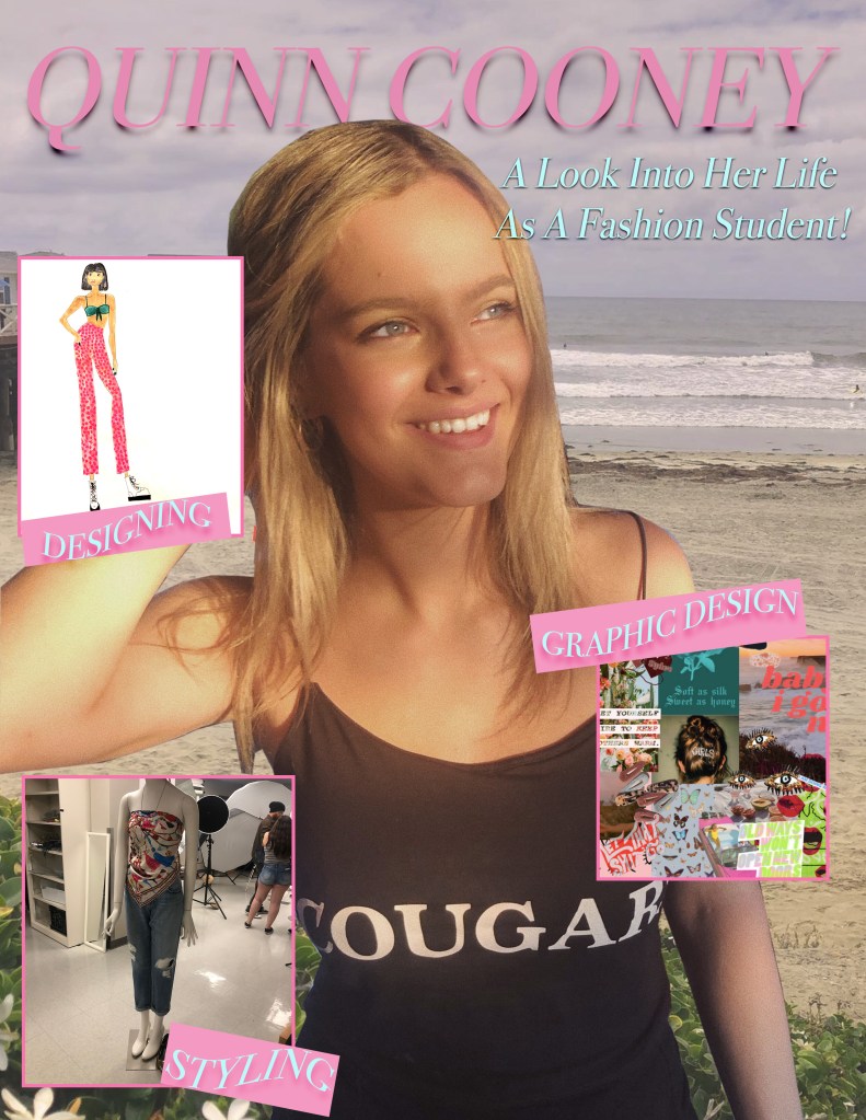
For my Graphic Design Project I have decided to create a magazine cover! My magazine cover has images describing what my blog is about and various images I have collected from my projects as a Fashion Merchandising Student. This project idea relates to my topic because it allows me to explain the three main things I am passionate about in my major and my potential career path, styling, designing, and graphic design. The way I created my project also made it easier for me to illustrate how these three main parts of my passion come into my life with the different photos I used.
The design influences that inspired me came from mostly the tutorial on the bulletin board with the different buildings at WSU and also from my color palette that I created when I designed my collection last spring in my AMDT 268 class. Research that I did to form my idea was just perusing magazine covers online and seeing what they consisted of. The significance of the background of my design is the main place that gives me inspiration, the beach back home in San Diego. The other elements of my design have significance because they are all projects that I put my entire heart into.
My design process started out by using the pen tool to cut out the image of myself and mask the background. Then, I embedded the picture of the beach into the background and used different hues and photo filters to make the images blend together the way I wanted them to. After that, I inserted my 3 photos using the frame tool and upped the stroke on the frame to 4. Then, I added the text in smaller frames around the pictures and rotated them. Finally I added my name at the top and added the heading underneath. I am very comfortable with photoshop so I did not run into any issues while creating this project.
For revisions, I decided to improve my project by adding drop shadows behind all text on the magazine cover because one of the comments I received on my draft was that drop shadows would help the overall composition of my project. I also chose to up the stroke on the frame around the pictures to 10 pt in order to make it more visible. Next, instead of having the text boxes be pink and light blue, I made all of the boxes pink and all of the text in the boxes light blue. Along with the color of the text changing, I also warped the text into a flag pattern in the text boxes. Lastly, I changed the font from an Arial style font to a more Vogue inspired font in order to really bring in the idea of it being the cover to a fashion magazine.
All of the elements and pictures I used in my project I collected myself on my phone. The only picture I did not take myself is the one of me and my friend Meredith, the photographer, gave me permission to use this picture!
